It's time to witness a clash of the covers as we dive into another edition of Box Art Brawl.
Before we hop into the ring with this week's competition, however, let's quickly recap what happened remaster was announced for Switch — and boy, was it a one-sided affair. The North American/European box art walked away with a staggering 86% of the vote, leaving the colourful Japanese edition with the remaining 16%.
We're keeping the GBA vibes going this week with another title that will soon be coming to Switch (albeit in the NSO Expansion Pack variety) as we look at two different pieces of cover art for Kirby & the Amazing Mirror. This pixel art platformer let you hook up four of the Nintendo handhelds for some colourful co-op as you each took control of a different Kirby, inhaling enemies and gaining some swash-buckling abilities.
With Europe and Japan opting for very similar designs (though the Japanese release did get a sweet landscape-oriented box), we have decided to keep this one as a duel, with Europe/Japan facing off against the North American design.
Let's get to it!
Be sure to cast your votes in the poll below; but first, let's check out the box art designs themselves.
Europe / Japan

This one tells you everything that you need to know about The Amazing Mirror — there are four Kirbys, and they all have different abilities. Simple, right? Our main pink variant sits front and centre looking happy as ever, and we like the overall good feel of the box art, with a light blue sky and angelic castle floating in the background.
North America

Woah Kirby! Why is he angry? Who gave him that sword? Why is everything so dark? The NA cover art is a reasonable swing from the previous variant, with an overall darker tone and having your friendly neighbourhood Kirby replaced by his sword-swinging variant as the main image. We like the ominous Meta Knight profile in the background of this one, even if the darkness feels a little less 'Kirby'.
Thanks for voting! We'll see you next time for another round of the Box Art Brawl.


Comments 41
Angry kirby will never be better than wholesome kirby 😂
I love how obvious it is how they just palette-swapped the artwork of sword Kirby and happy skipping Kirby to make the NA cover
I either need a lot of sleep, or these are labeled incorrectly in one of the areas of this article.
I'm going to guess that Edgy Kirby is the NA thing (cause it usually is)...unless Happy Kirby ate an Edgy Kirby?
Kirby is joy and sunshine, so the darker cover is a little odd!
Edgy Kirby = best Kirby
Ah yes, this is the clear Example of what i have read about those Covers.
In the US it has to be angry ^^
Edit: They changed out the Red Kirby with the normal^^
Box Art Brawls Current Total:
Europe: 63
Japan: 66
North America: 69
Australia and New Zealand: 1
I'm weird in preferring the NA one. Angry Kirby just looks cute anyway. Lol. I prefer the starry night background of the NA one as well.
Why so serious, US? PAL wins this week (but let's be honest, there's practically nowt between 'em!)
I will never understand NoA’s need to make Kirby angry on every single cover. Easy win for EU/Japan this week.
NA hands down. The overlay on Meta Knight is just too cool. The titles placement landing right on the tip of the sword on the Japanese version bugs me, whereas the NA version’s ing all the way through the title with the light reflection on the tip is more visually appealing
Europe/Japan for me!
I prefer happy Kirby!
Green Kirby is P***** off in both versions. Haha.
Not a fan of angry Kirby, but what makes Europe/Japan better for me is that you can see much better the titular Amazing Mirror (although it's cool to see Meta Knight on the North American one considering his relevance to the story)!
I voted the PAL version.
Not generally a fan of Angry Eyes Kirby.
NA for me! The layout feels… IDK, cleaner.
I kinda prefer the Europe/Japan one, although there's not that much difference. The NA one feels more cluttered to me.
I cannot decide which one I'll choose. I kinda like the Meta Knight (or is it Dark Meta Knight?) on the American one, but the other one shows the actual Amazing Mirror in the sky. I think I'll go Europe/Japan this time.
For comparison, here's the Japanese box art, which features TOO MUCH SKY

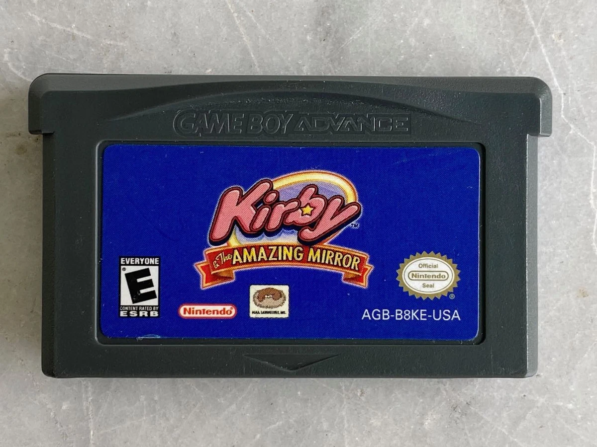
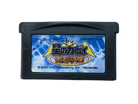
And as usual, the cartridge art. This time we have a "Triple Deluxe", as each region has different art.
American

European

Japanese

Swapping Red Kirby with Pink Kirby is one way to appeal to us red-blooded Americans, but I wish they had gone the extra mile and swapped all the Kirby colors around.
You know, just because.
@JohnnyMind Didn't even notice Meta Knight at first.
I like the Japan artwork, but on the other hand, I prefer the Japan artwork.
NA just for the Meta Knight background alone
Smiling Kirby for sure!
I went with the US art because of the Meta Knight sighting, but both are fine.
Yet once again NL gives EU the top billing on the shared artwork even though the game (& thus the art) both premiered first and was conceived in Japan. EU is sharing the JPN art & not the other way around so JPN should get top billing, "Japan/Europe". I know I'm probably not going to get an answer since this is like the 3rd or 4th time I've brought this up, but is there a reason for this? If two regions share art, the region of it's development/premier should get top billing.
Happy Kirby >>>>>>> angry Kirby
It's so funny they made Pink Kirby angry by switching the angry Red Kirby to happy. Never change, NA box art. Except maybe do?
I like that there's an actual background in the PAL one. Platform games are mostly about navigating terrain, where the location itself is the star of the show.
He is not angry. He is determined
NA. for me, says a european guy
@darkswabber If you don't know, he's not angry he's determined. 😁
Any idea why above the USA cover art it Says Japan? Probs for a country it doesn't exist: North JapaMerica🤪
mmm, Japan or Japan? The hardest choice in existence! Too bad the game apparently never got ported to the USA. At least, according to the headers.
The NA cover's art feels cramped with the main Kirby being larger and having the sword which takes up more space. It shoves all the other Kirby guys over and almost fully blocks view of the mirror. Add the game logo and the box is just totally crushed. The Euro artwork has a bit of space for everything that makes it more visually coherent and enhances the box art. Easy win for the Euro box for me.
Ah the long story of angry kirbys being randomly found on american boxarts. It's meme worthy really. The EU one gives a better idea of the actual atmosphere of the game so I voted for that.
But obviously the real winner here is green Kirby being all fancy giving a little choreography with his tophat while being super angry at the same time for some reason. And he happens to be on both versions so there you go everybody wins.
The NA/EU artwork for Mario vs. Donkey Kong won by 84%, not 86%. Otherwise, combined with the 16% for the JP artwork, it would add up to a total of 102%.
To the editor: The North America subsection is labeled as Japan. You may want to fix that.
On that note, voted for NA. Meta Knight makes it for me.
Gotta go with North America on this one again. It’s part nostalgia as yet again for like the third week running these are all childhood favorites of mine but also it just genuinely is so cool and mysterious looking.
Either or for me. Both pretty similar in my opinion. Vote went to Europe seeing as that's the version I'd have got if I'd been interested in this game back when it originally launched.
Kirby isn't angry, he's determined. Looks angry though.
@RR529 - My guess is that they’re just sorting alphabetically.
And here we have the perfect example of the “NA Kirby is hardcore/angry” trope . Never quite understood why NA, and only NA thought this had to be done, but I guess it makes a funny juxtaposition with the boxart used for every other region.
Show Comments
Leave A Comment
Hold on there, you need to to post a comment...